Brand System for a Canadian Ayurvedic Lifestyle Brand.
Date
May - July 2025
Industry
Health & Wellness
Our Role
Brand Positioning, Verbal Identity, Visual Identity, Packaging Design
Overview
Sevva is a Canadian wellness brand rooted in Yoga and Ayurveda, offering eco-certified meditation tools, AYUSH-certified Ayurvedic products, and mindfulness rituals designed for modern daily life. We came in as the brand's first creative partner, with no existing positioning and visual language to work from.
Challenge
The clients came in with a clear vision. Before any creative work could begin, the relationship had to be earned. The scope was also deeper than a typical identity project, starting with positioning workshops before a single visual was explored.
Solution
A complete brand system built in two phases. First, a thorough positioning foundation. Then a visual identity anchored by the Inner Flow mark, carried through to a packaging suite that grew well beyond its original scope as the launch took shape.
Brand Positioning
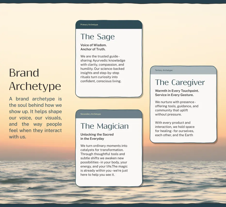
Through discovery calls and structured workshops, we worked closely with the clients to explore the brand story, core values, personality, archetype, USP, and four distinct audience personas. They knew their brand deeply but never had to articulate it in a structured way.
Sitting with them through that process, asking the right questions and pushing for clarity, gave every subsequent design decision a clear place to land. The verbal identity followed: brand voice, grammar, vocabulary and a product naming system rooted in Ayurvedic convention across three product categories.
The Visual Identity
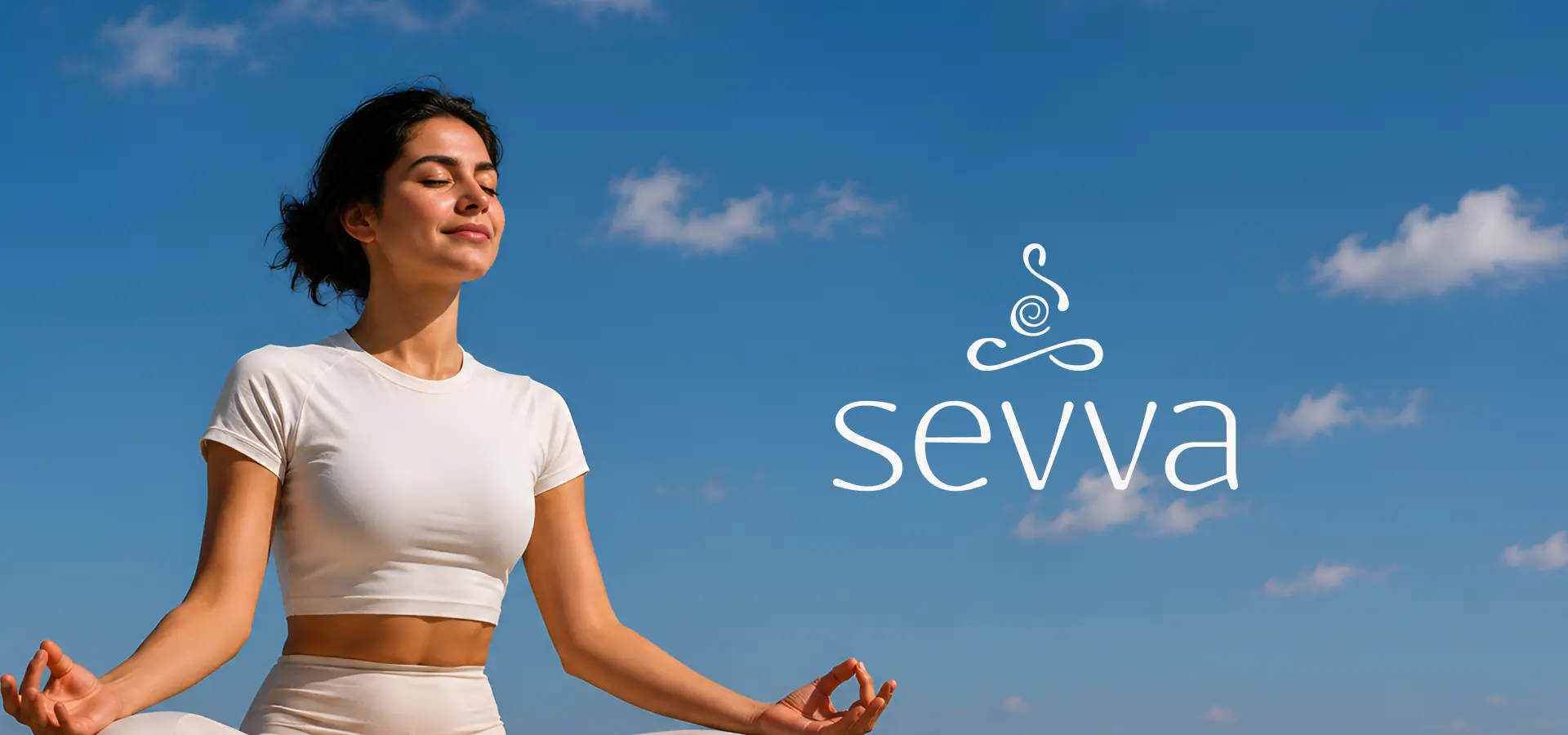
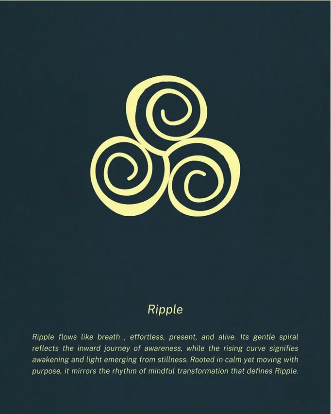
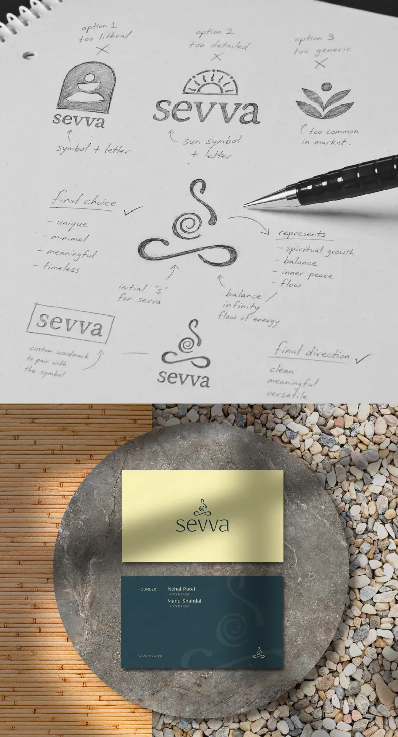
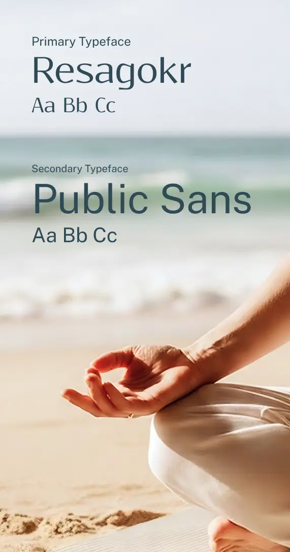
Inner Flow, a brand mark built on liquid movement with a soft hand-crafted wordmark, captured exactly what the brief kept coming back to: light, breathable, water. The colour final palette is named after the natural states of stillness. A system that could carry the brand across every surface without losing its calm.
The brand guidelines covered logo usage, colour, typography, photography style, brand pattern and product nomenclature across 45 pages.

Packaging Design
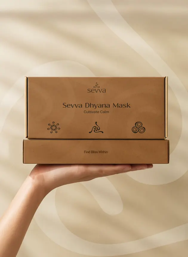
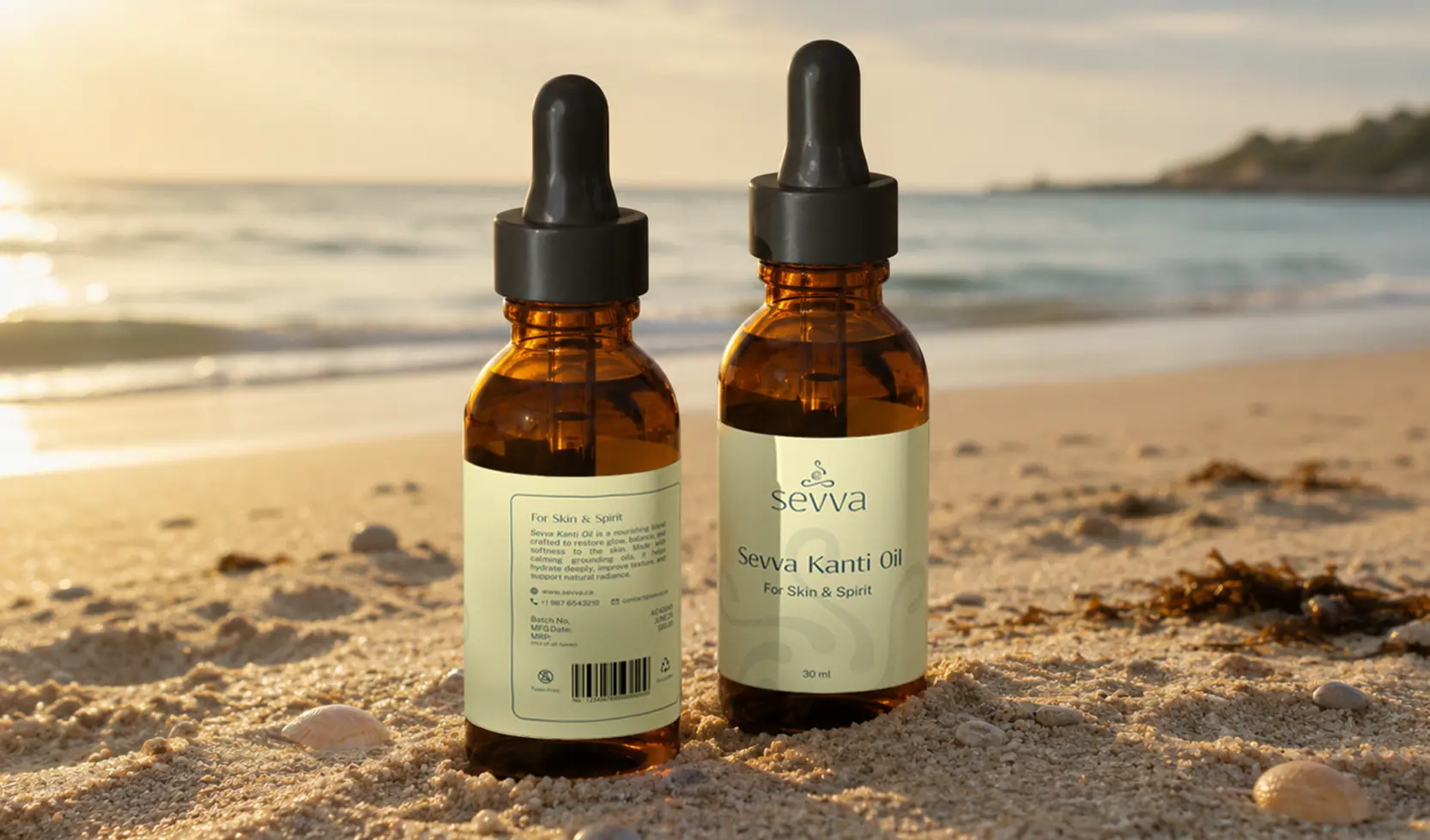
The scope started with a thank-you card and product tags, then grew to include a mat box, mat label, yoga block label, sleeping mask box, yoga strap, and label tags as the launch took shape. The thank-you card was printed on seed paper, made to be torn up and planted. Every piece sat within the same mark, colour and type system.