Visual & Experience World for IRAADA 2.0.

Date

February - April 2026

Industry

Events & Experiences

Our Role

Art Direction, Visual Identity, Website, Brand Experience Design

Overview

Iraada 2.0 is a three-day retreat by JITO Chennai Plus, built for young people figuring out what actually matters next in their lives. Set in The Tamara, Kodaikanal, for 150+ attendees, the programme needed a visual world that matched its intent. We came in as the branding partner to build that world end-to-end.

Challenge

One visual language had to hold across 20+ touchpoints, digital and physical, intimate and large scale. Direction came in stages, with new requirements arriving throughout the process. The system had to absorb every change without losing coherence.

Solution

A visual identity system with clear core elements that carried consistently from digital marketing through to on-site production and experience design. Every touchpoint came from the same set of visual rules.

The Identity

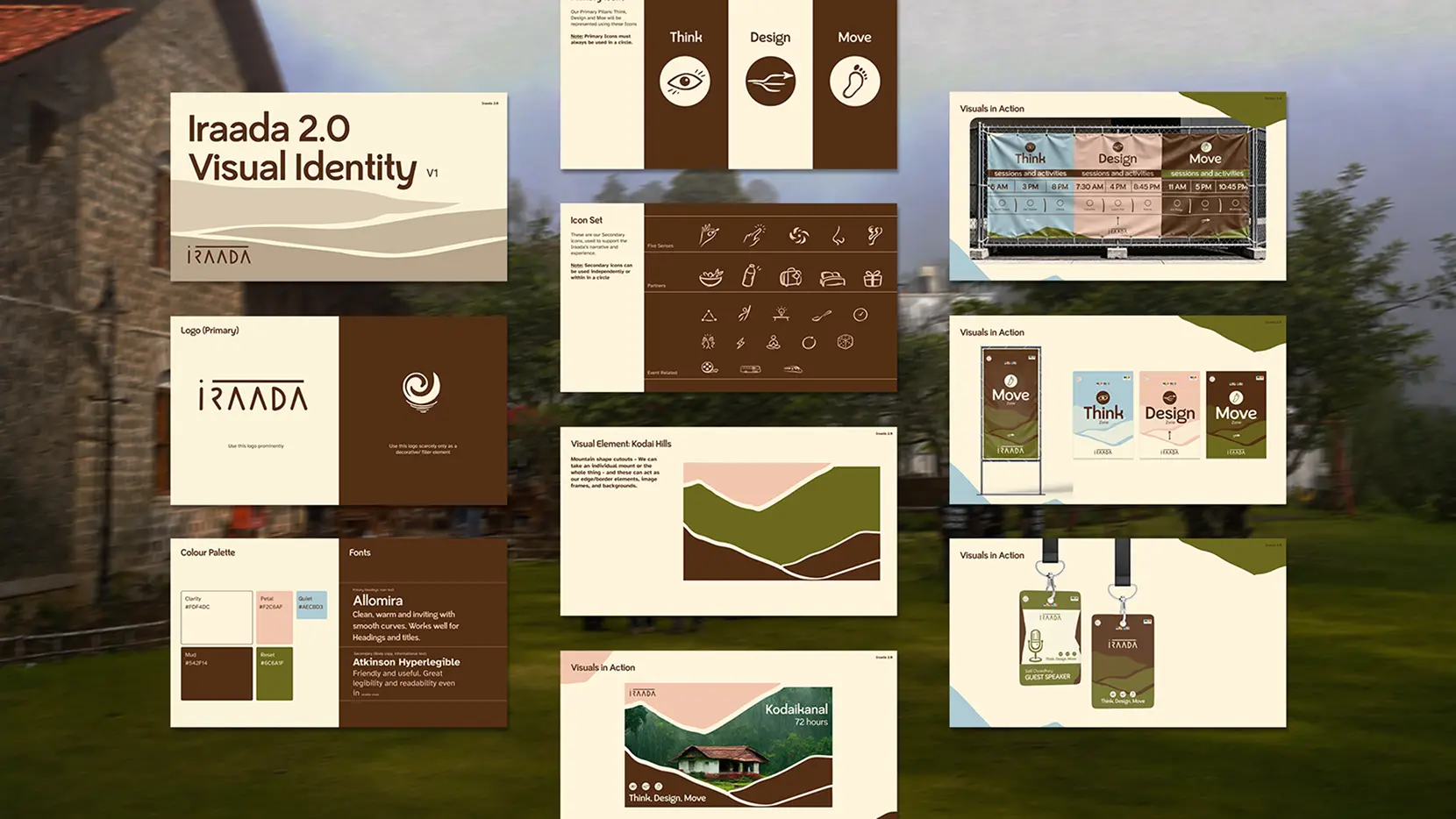
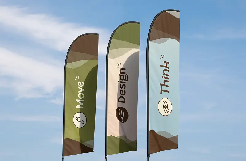
The final direction was warm, organic and earthy. Mountain cutouts were the core visual principle, paired with a refined palette and a typeface that was warm but readable. The original IRAADA wordmark was retained for the recall it carried. Custom hand-drawn icons for Think, Design and Move and a full secondary illustration set gave the identity its human quality.

The Website

The website had one job: communicate what Iraada was, then move people toward registration. Information clarity came first. The identity showed up in every section through mountain elements, icons, illustrations and animations that made it feel whole and alive.

Marketing Materials

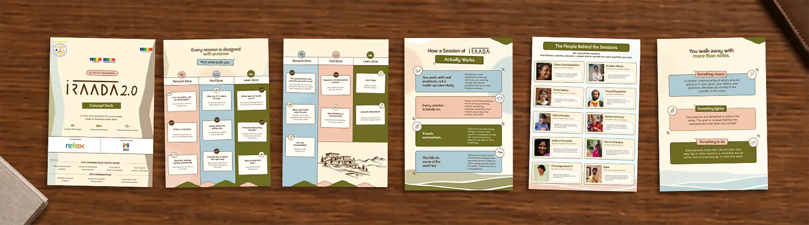
Throughout February and March, social media creatives, animated posts, and event collateral covered everything from speaker announcements to registration phases and countdowns. The visual language remained consistent across all formats and platforms.

Merch and Goodie Experience

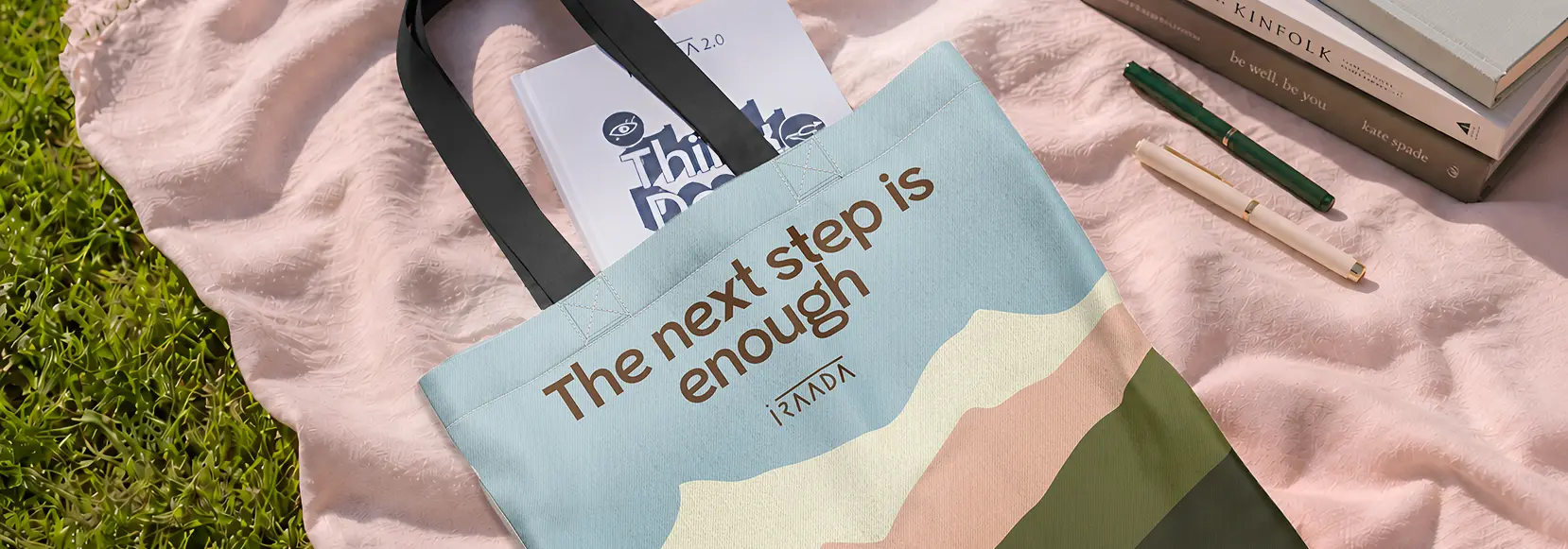
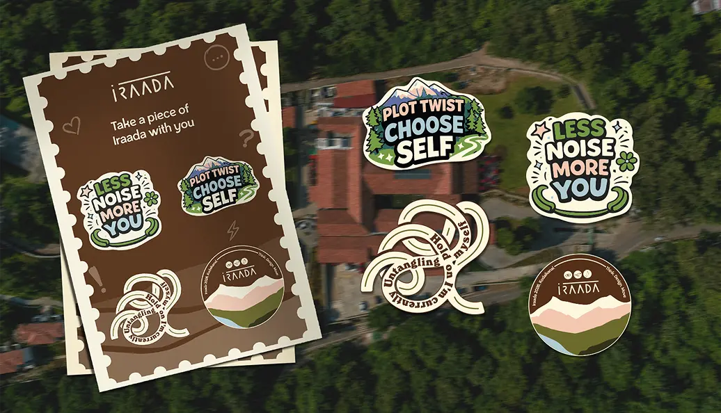
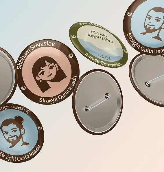
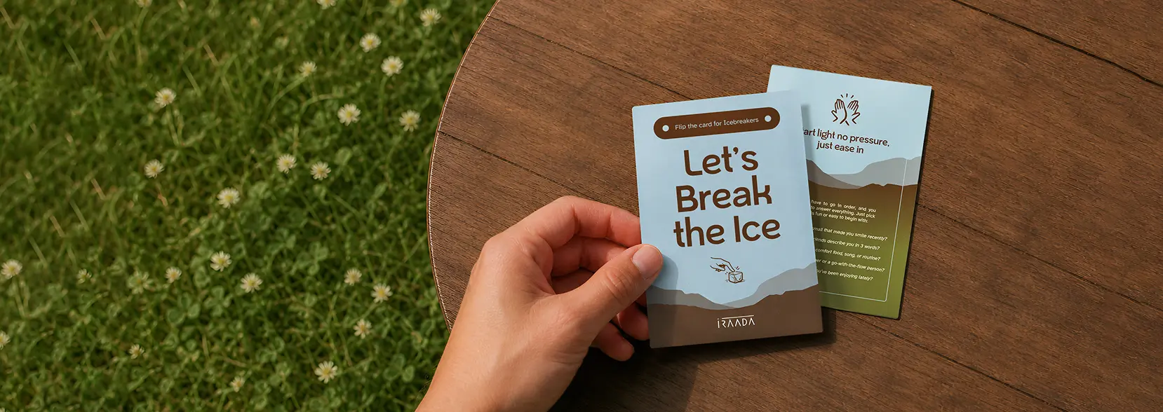
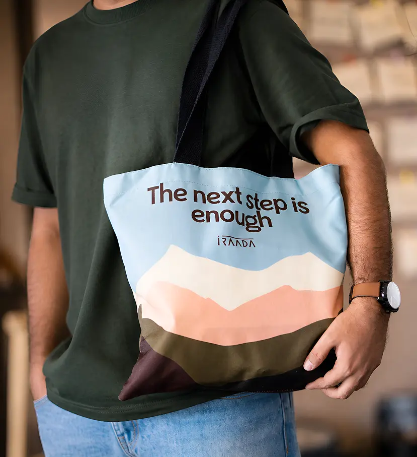
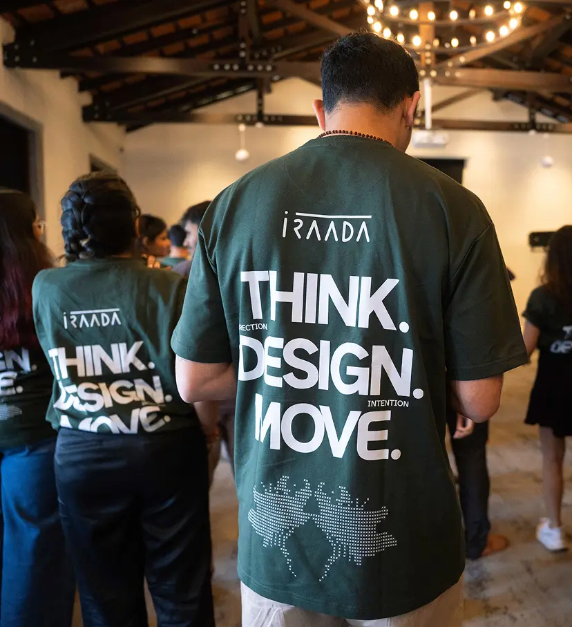
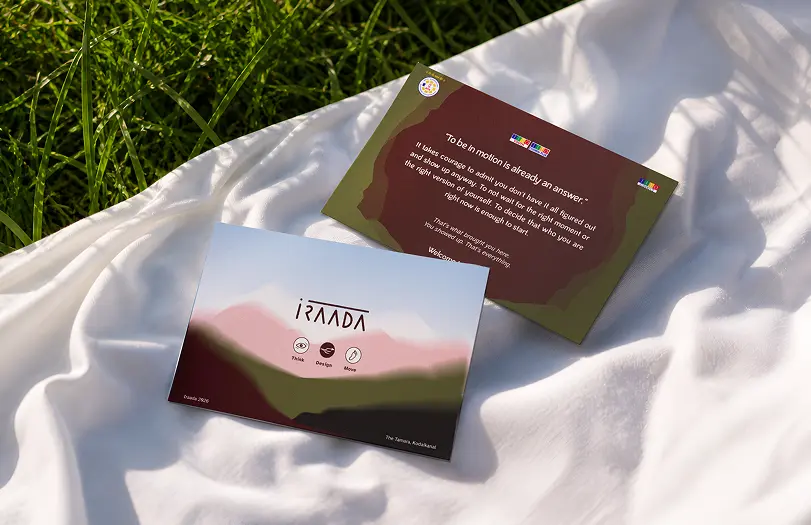
On arrival, every attendee received a goodie bag carrying the brand into their hands from the first moment. T-shirt, tote bag, workshop journal, postcard, badges and stickers, each piece part of the same visual system. The icebreaker card was placed in their rooms ahead of check-in. The tote went through four design explorations. The final direction was unanimous.

Production Design

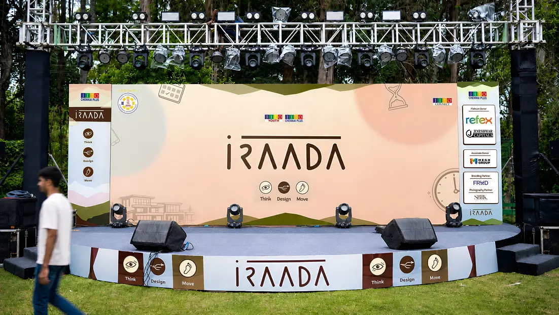
Flags, foam boards, welcome boards, stage skirting, map signage and zone banners made up the production layer of the event. Each zone carried its own colour from the identity system while staying part of the whole. The zone signage went beyond wayfinding, displaying the session schedule for each space so attendees always knew what was happening and where. The same language held on every surface.

Experience Design

The fringe activities each had their own signage that communicated what the activity was and invited participation without heavy copy. Every piece stayed on brand while adapting to the nature of the activity.

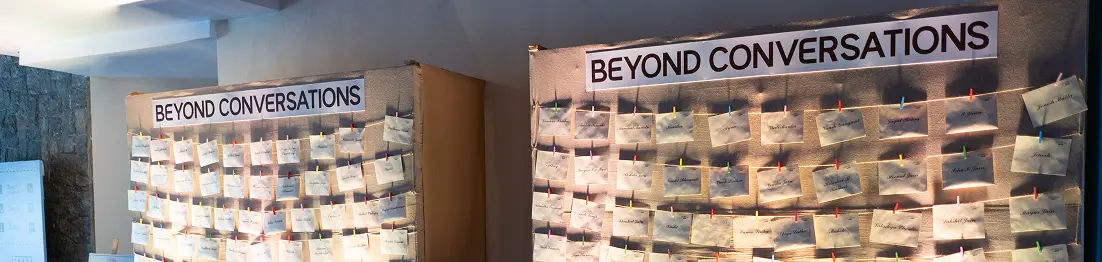
Beyond Conversations was the standout. Two walls of envelopes, each bearing an attendee's name, with the IRAADA wordmark stamp and a custom Kodaikanal-inspired ink stamp on the back. Anyone could slip in a letter, a note or a message for someone. At the end of the retreat, every attendee collected their envelope. It was one of the most talked-about moments of the event.