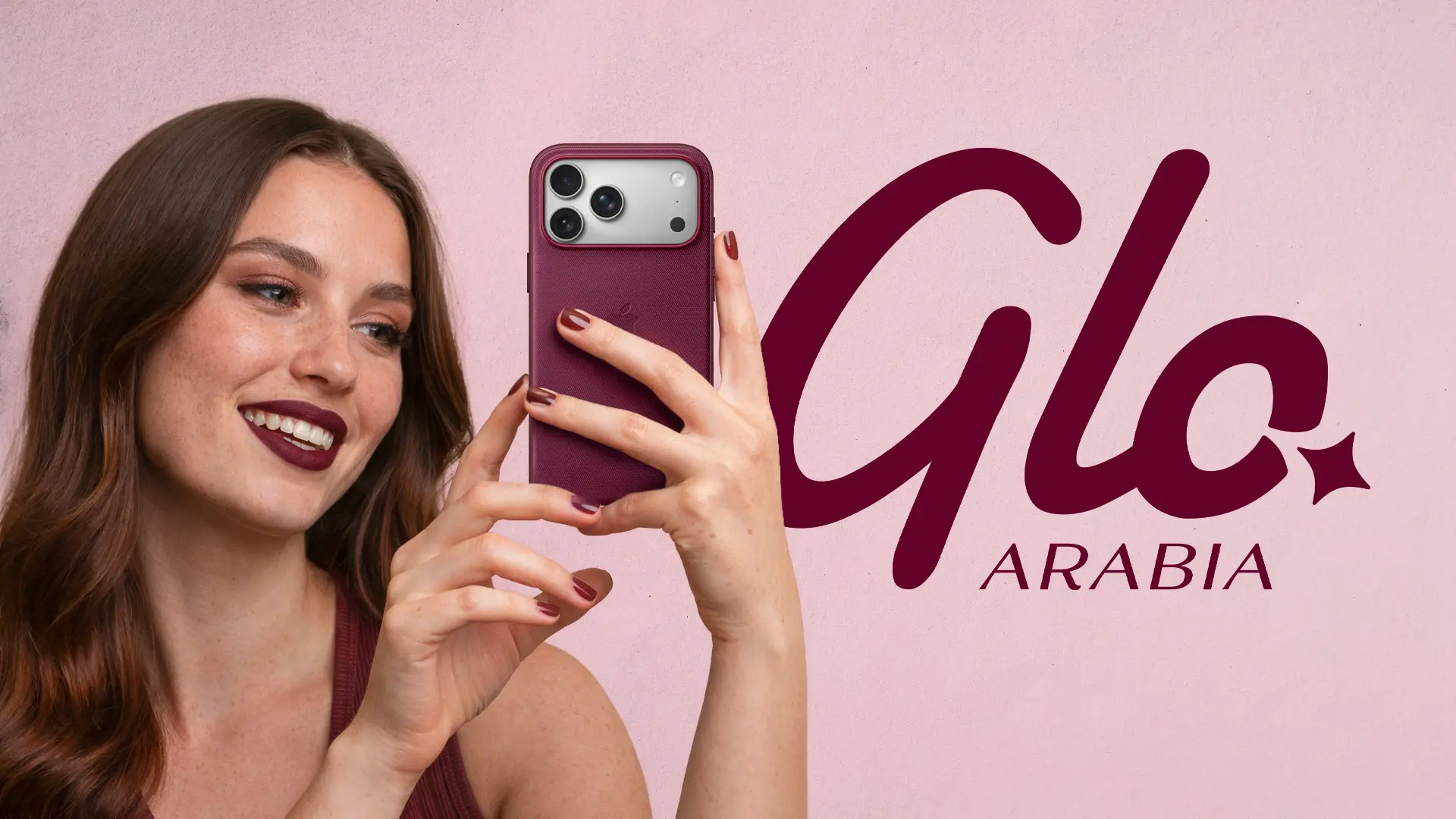
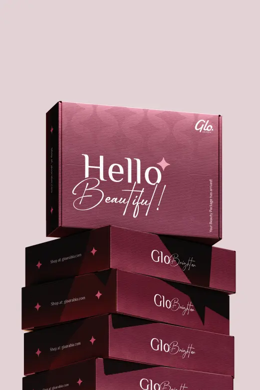
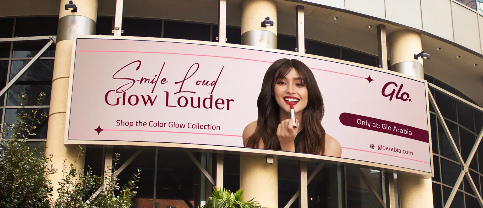
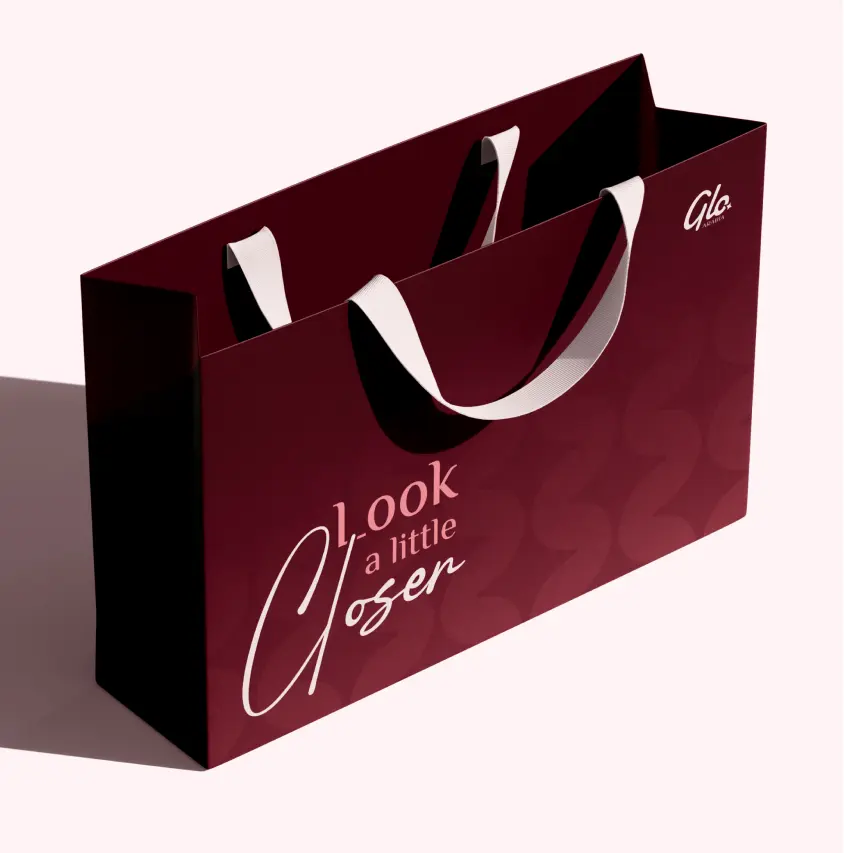
Glo Arabia is a Qatar-based online retailer of authentic cosmetics and skincare, built around Korean beauty products and a genuine anti-counterfeit positioning. With retail expansion across the GCC underway, the brand needed an identity that could hold up in the real world. It had no visual system to speak of. The logo was a Canva file.
Challenge
The cursive "glo" script carried some recognition with existing customers and had to be retained. Everything else needed to be built from scratch, for a multicultural audience across Qatar, the UAE, Bahrain and Oman, in a category where how a brand looks is inseparable from whether customers trust it.
Solution
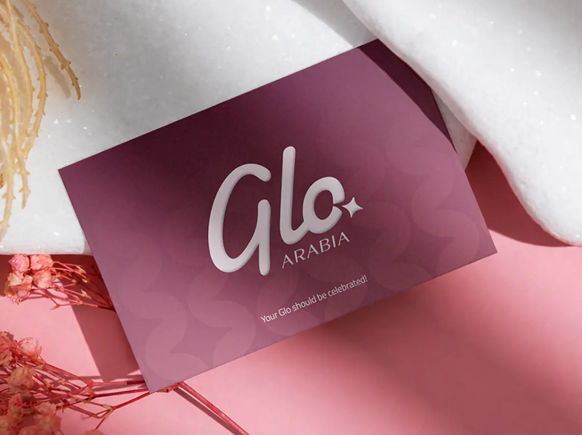
The original "glo" script had warmth worth keeping. The work was to give it structure without draining it. The refined wordmark tightens the letterforms, introduces a four-point star as a recurring brand detail, and pairs the script with "ARABIA" in spaced serif caps carrying Arabic typographic influence.
The Identity
In a category where trust is the primary purchase driver, a mark that reads as deliberate and consistent at every scale does real commercial work before a customer reads a single product description.
Logo System
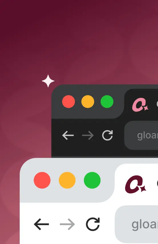
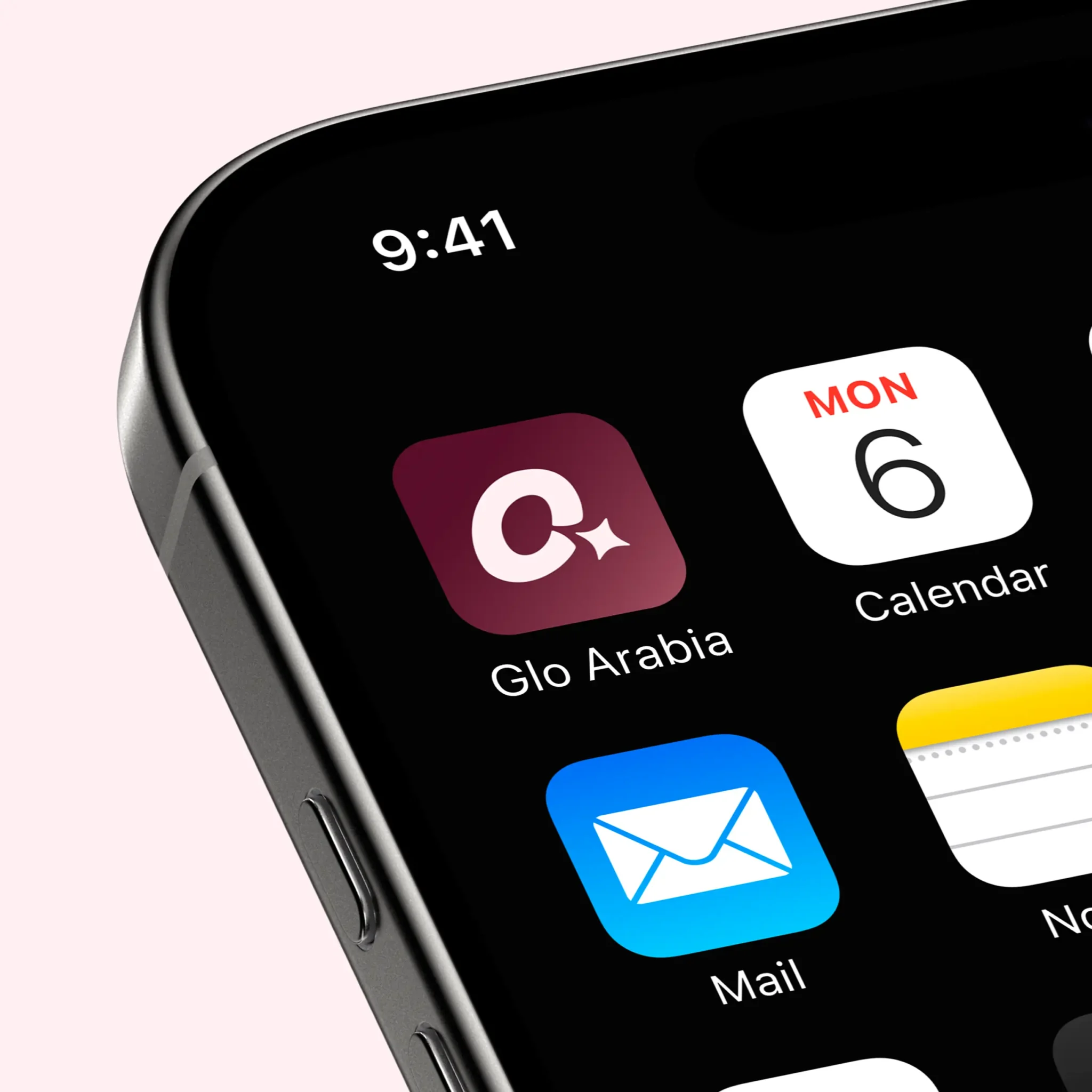
Three variants cover every context: the full "Glo Arabia" lockup for storefronts and packaging, the "Glo" script alone for smaller placements, and the "o" and star brandmark for icons and favicons. Clear space rules and minimum size specifications are documented for digital and print.
Colour System
The original purple was replaced with a deep maroon as the primary colour, paired with a warm blush white. Maroon works here precisely: it sits in a premium, trustworthy register without the coldness of high-luxury minimalism, which is the exact positioning Glo Arabia needs to own with its audience.
Typography
Both El Messiri and Cairo natively support Arabic and Latin within the same font family, so the identity works bilingually without two separate design systems. For a brand whose customers speak Arabic and English across five markets, that consistency is as much a business decision as a design one.
Brand Pattern
The Glo Flow pattern was built from the curves and star of the brand mark. On packaging it runs at full coverage; on digital backgrounds it sits at reduced opacity, keeping the brand present without competing with content.
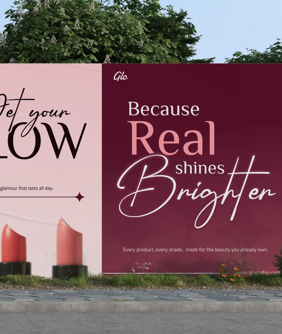
One visual language had to hold across 20+ touchpoints, digital and physical, intimate and large scale. Direction came in stages, with new requirements arriving throughout…