Packaging-led Brand Identity
Date
2023-2024
Industry
Food & Beverage
Our Role
Visual Identity, Packaging Design, Brand Communications, Website
Overview
Sip Happens is a packaged cold coffee brand aimed at aspirational youth. The founder came in with a name, a product vision and one clear brief: the packaging should be the reason why someone would pick up the cold coffee.
Challenge
For a brand entering the market for the first time, packaging is the only introduction it gets. It had to attract attention immediately, and it had to do it within a tight production timeline.
Solution
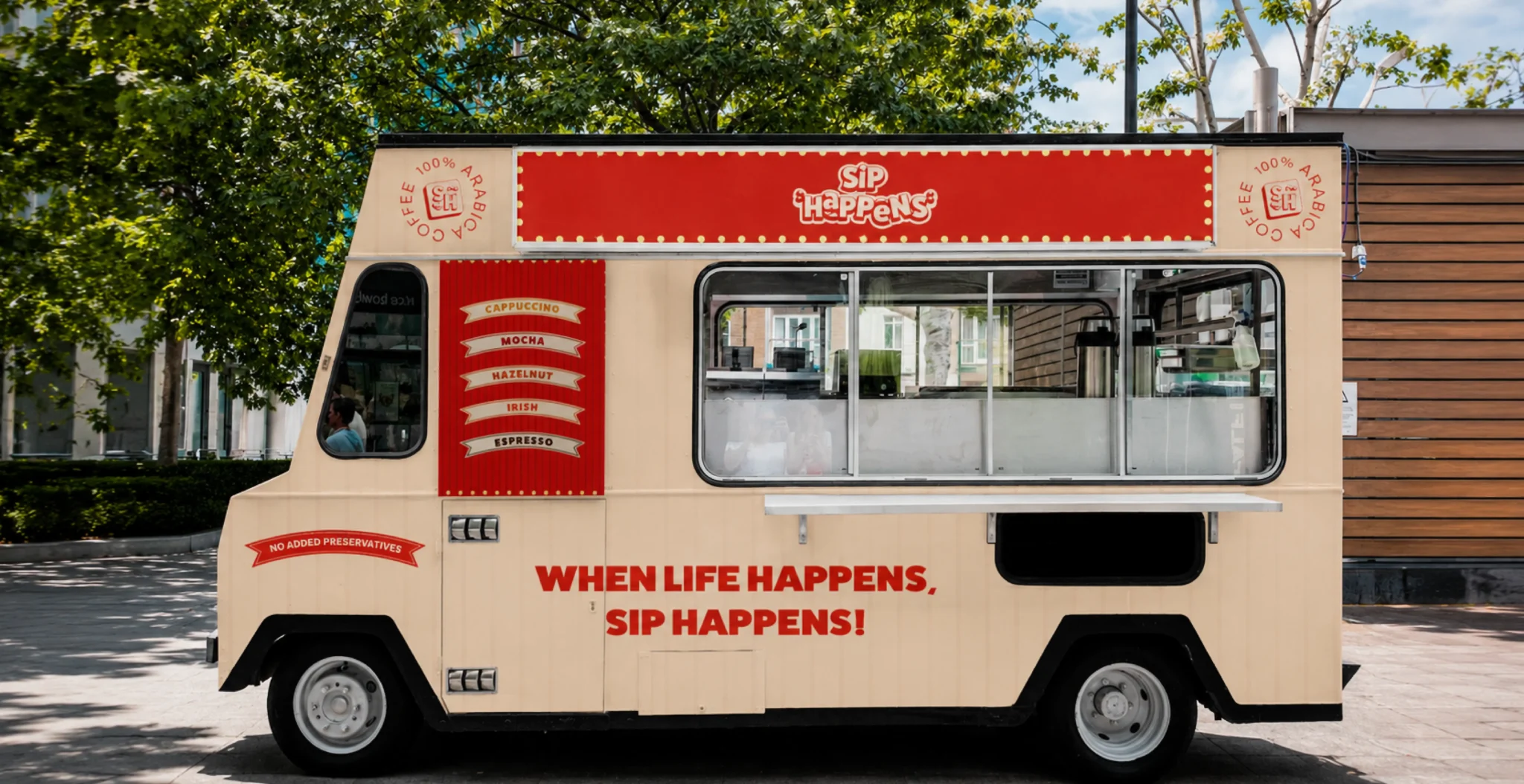
A retro diner-theatre identity with a full packaging system, print materials, digital presence and brand guidelines. The same visual language then expanded when the range grew for summer.
The Identity
From three moodboard directions: Playful, Edgy, Retro. The brief responded to the space between the first and the third. Three full art directions were developed from that point. The chosen direction used a playful sans-serif wordmark with bold type. Colour came later, during the packaging phase. Red was the right call.
Packaging Design
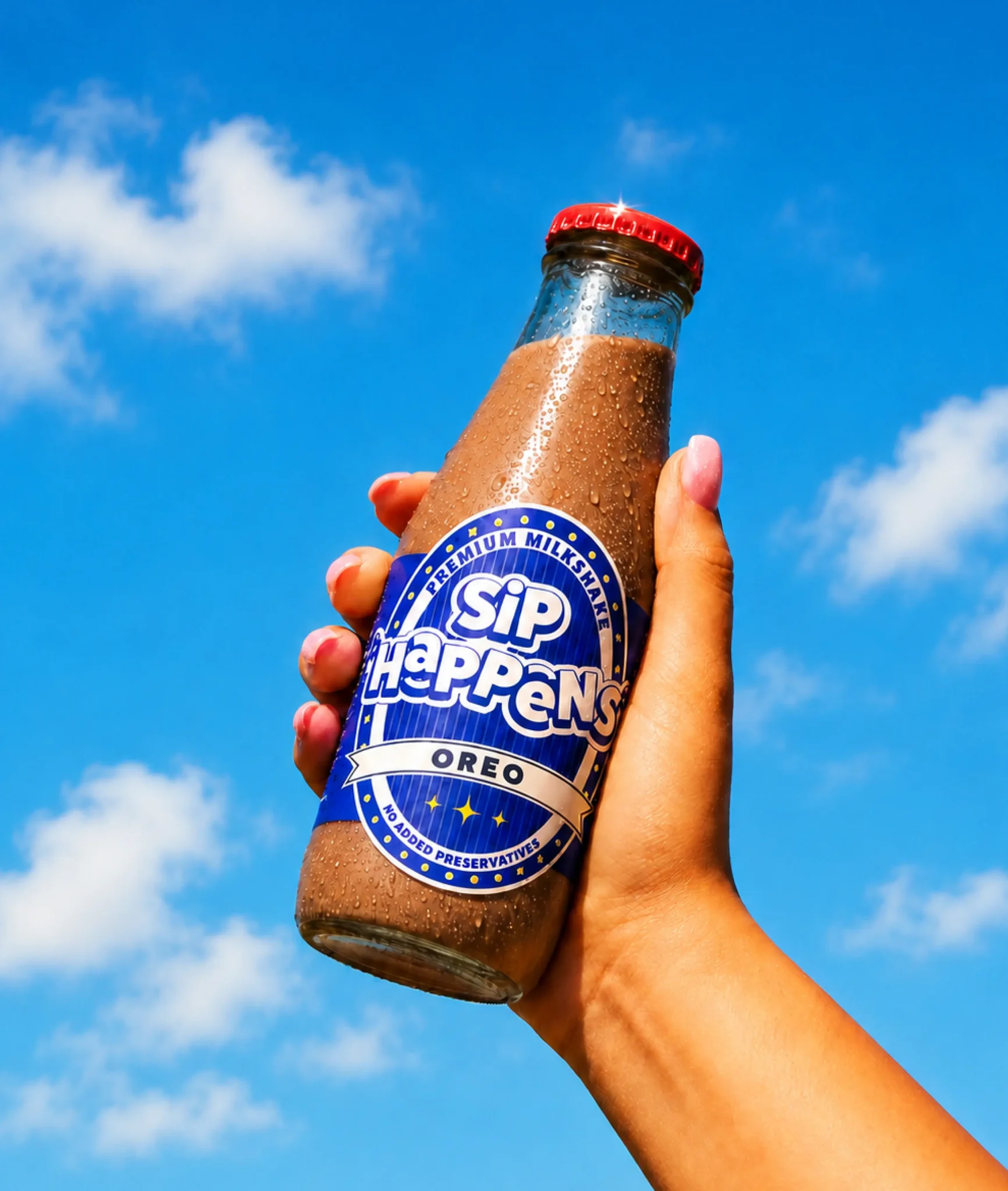
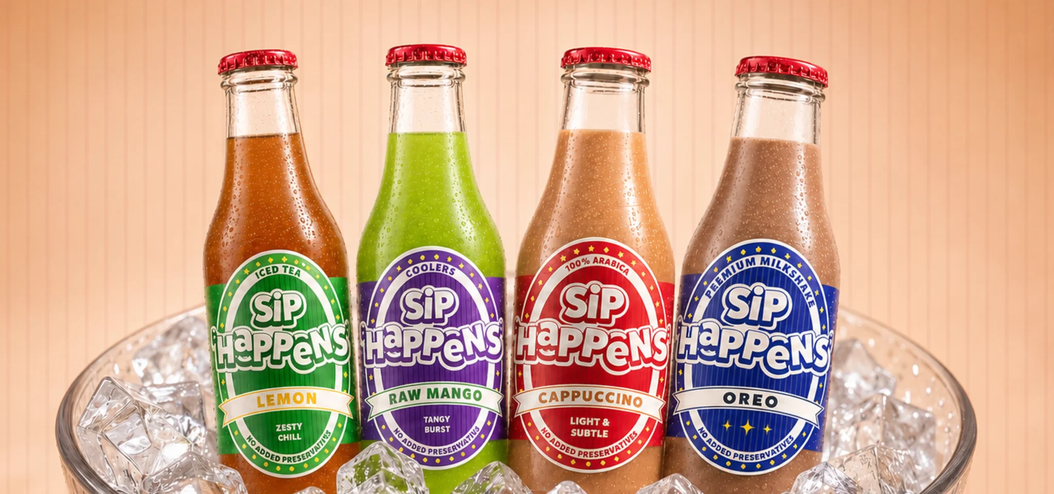
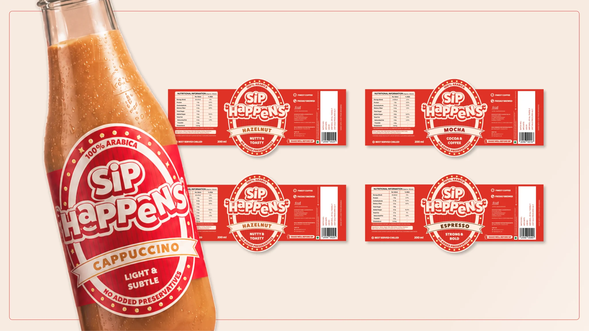
The label went through three rounds. Vertical stripes in the background, a cream bordered frame with dot-light detailing, and a flavour ribbon at the centre that changes per variant. Five cold coffee flavours launched under the system, each with a two-word tasting profile on the label. It took Three to four rounds with the print vendor to get the red right in production to finalise the label on 200ml glass bottles.
Marketing Materials
A branded feedback form was built during the packaging phase to collect early tester and flavour reviews before the full launch. A product poster, company profile, business cards and letterhead followed. Visual identity guidelines covered logo usage, colour palette, typography and application rules.
Digital Brand Activation
The Instagram page was built from scratch: a nine-post launch grid and custom highlight icons matched to the visual system. Sip Happens was targeting concerts, small cafes and restaurants where young people already were. The page needed to look like a real brand before the first bottle shipped. A WordPress website was built alongside it to introduce the brand and present the product range to new stockists and customers.
Brand Expansion
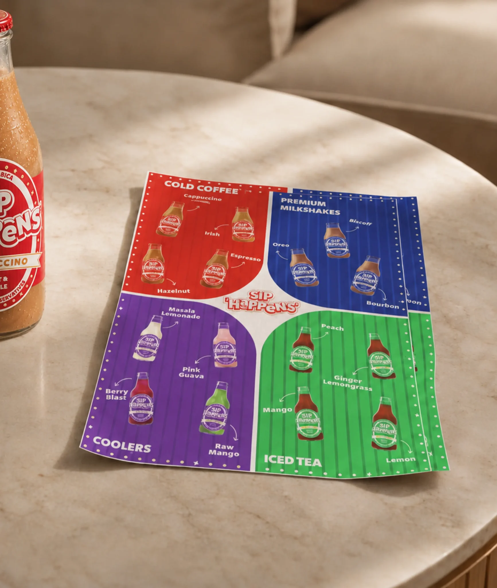
Nearing summer, the range expanded beyond cold coffee with three new categories: Premium Milkshakes, Coolers and Iced Tea. The design architecture stayed intact. Each category got its own colour within the existing system. Blue for milkshakes, purple for coolers, green for iced tea. Twelve new flavours across the three ranges. A full product pamphlet and individual category posters completed the expansion.
One brand system. Four categories. Sixteen flavours.